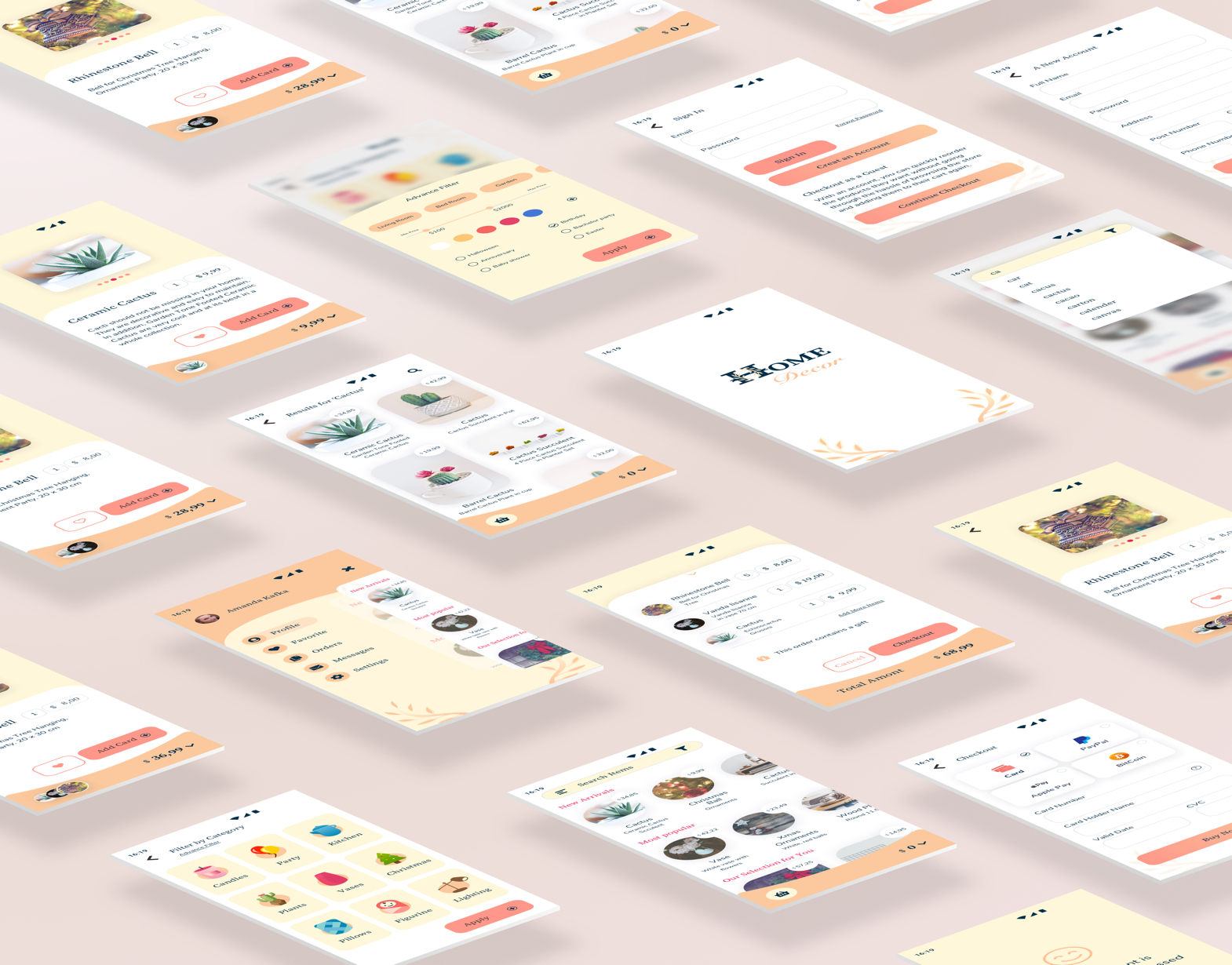
Home Decor
E-commerce UI Project
Responsive Web App
- Building a Cohesive Brand
- Brand Guideline
- Desktop design
Responsive E-commerce Web App
UI Design Project
Overview
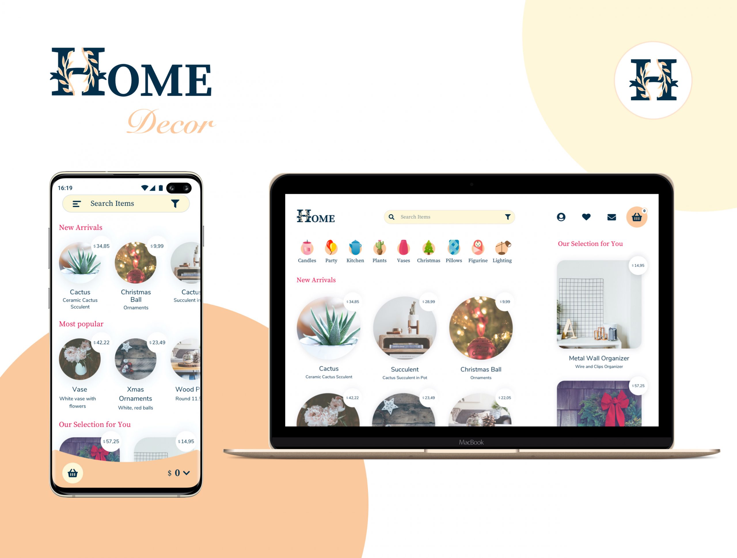
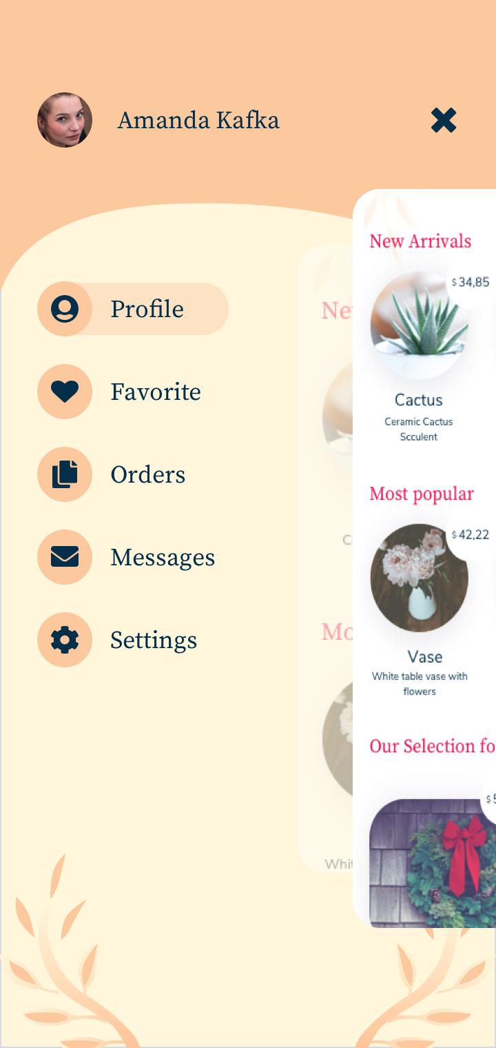
Home Decor is a web responsive e-commerce app that focuses on decor items. My aim is creating a cohesive brand and a useful shopping platform.
Compare
There are several similar applications, such as Wayfair and Decor Matters. But Wayfair doesn’t have an app for iPhone, and it has too many annoying ads on its website. Decor Matter doesn’t have a web site, but a mobile app for iPhone.
Problem
It is necessary to present the product to the user as much as possible on an e-commerce website. However, it should neither be full of annoying elements nor too many product options on one page.
Solution
I believe less is more elegant. I choose to create white space between the items so that the user can focus only on the objects. Also, the user likes to see some recommendations depending on their selections.
Users
This application is for users who want to buy decor items.
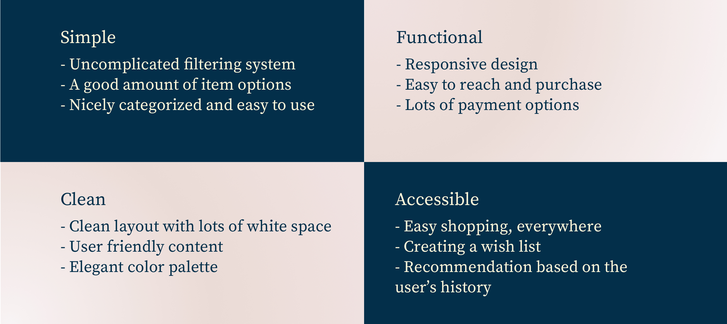
Key Features
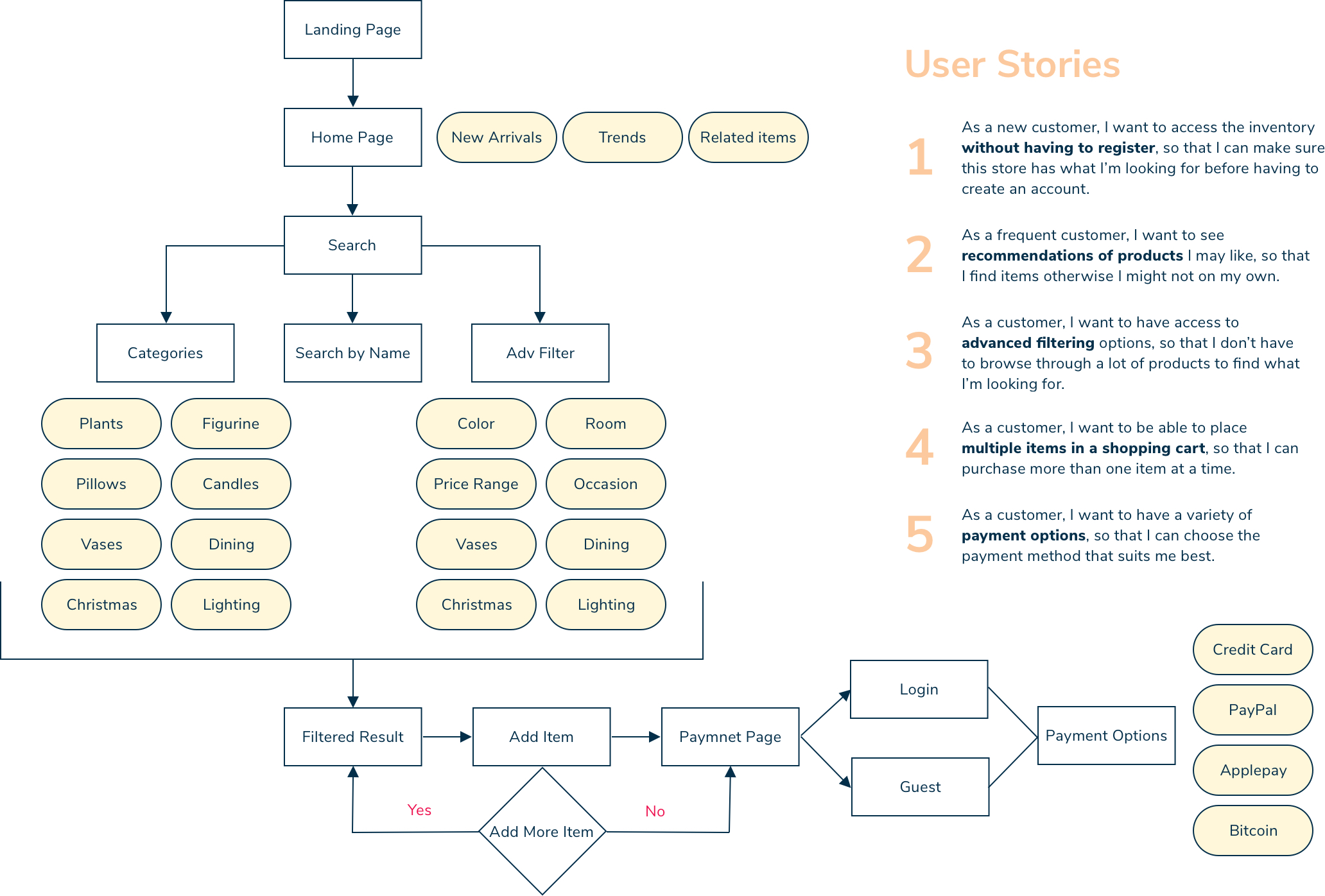
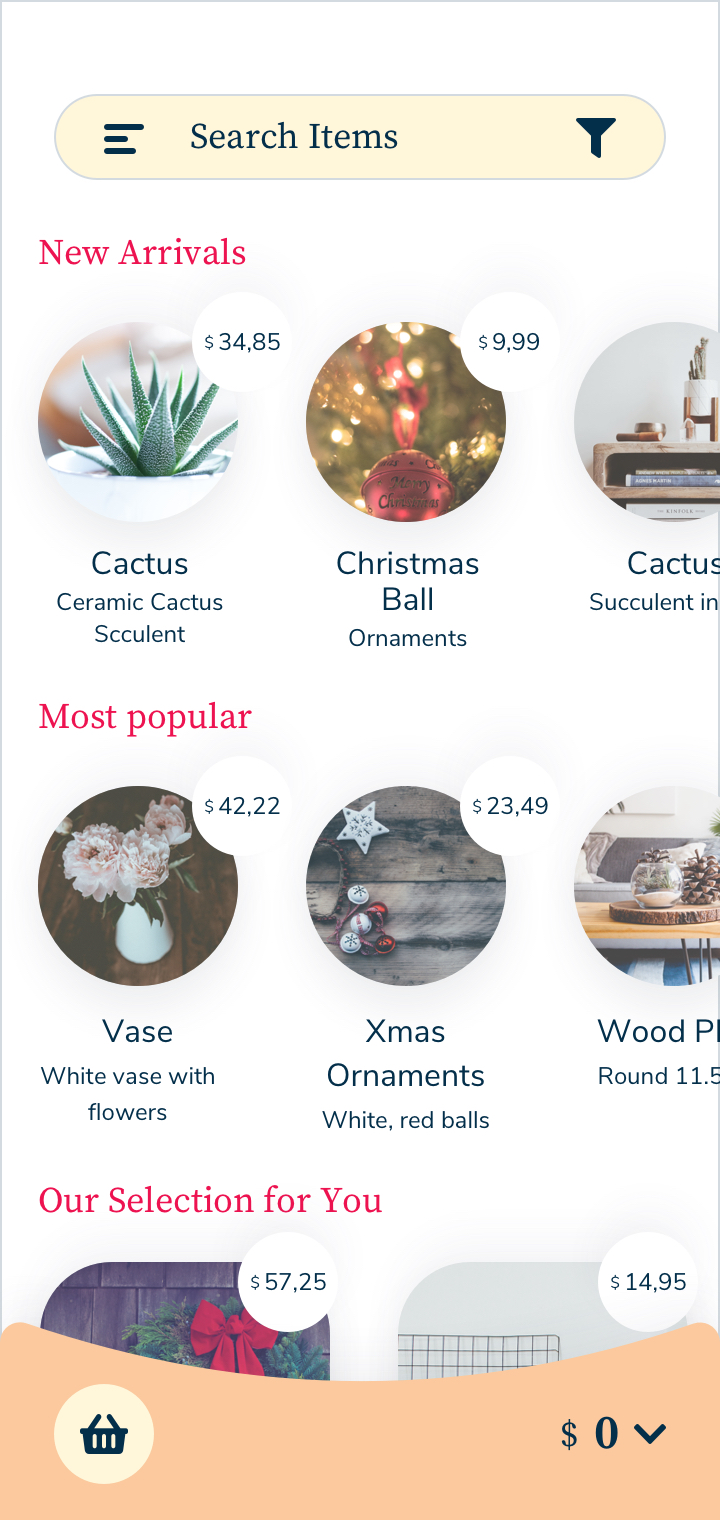
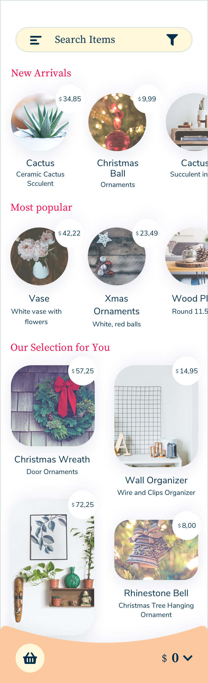
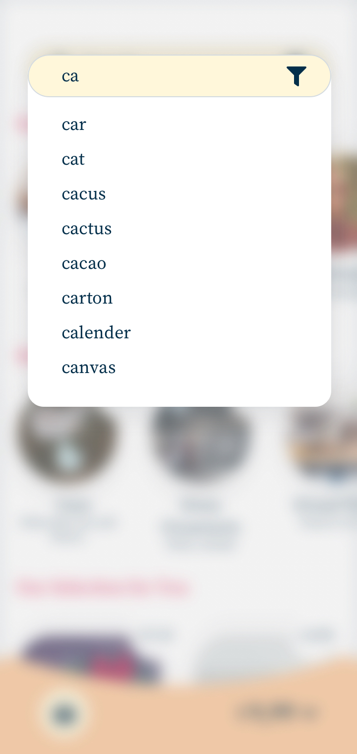
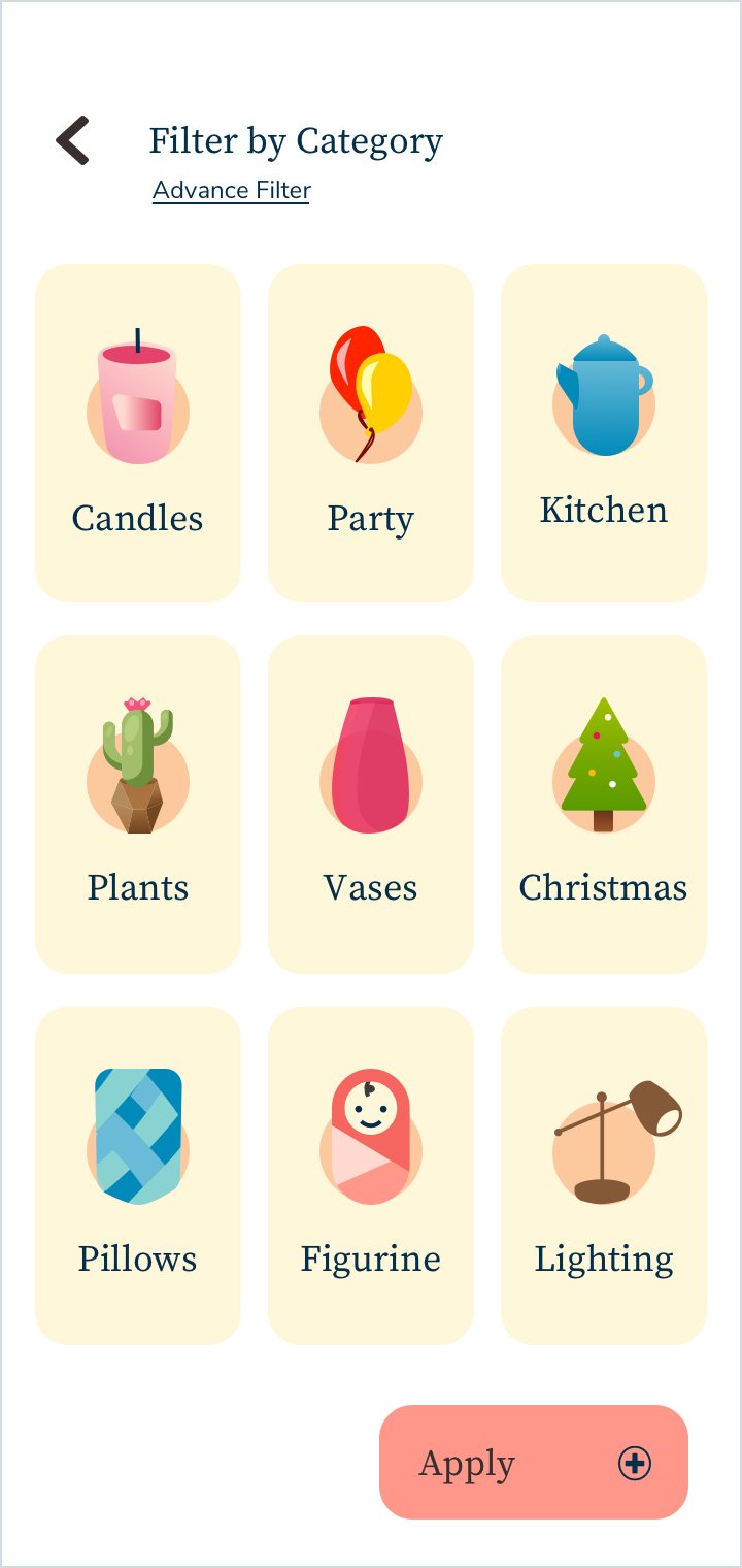
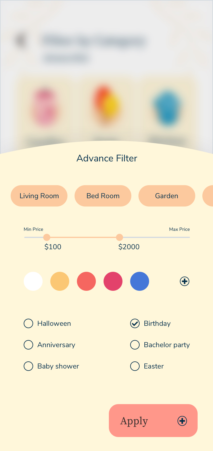
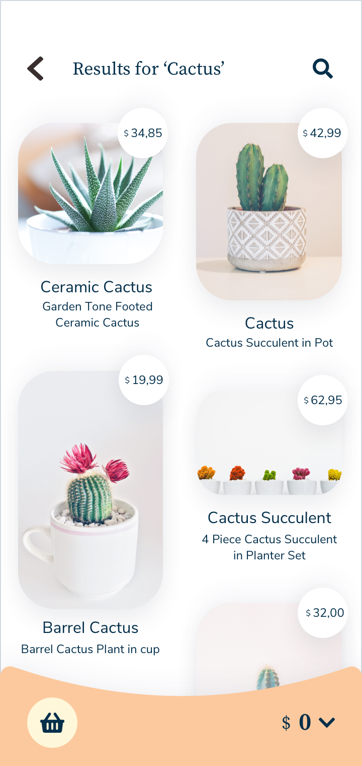
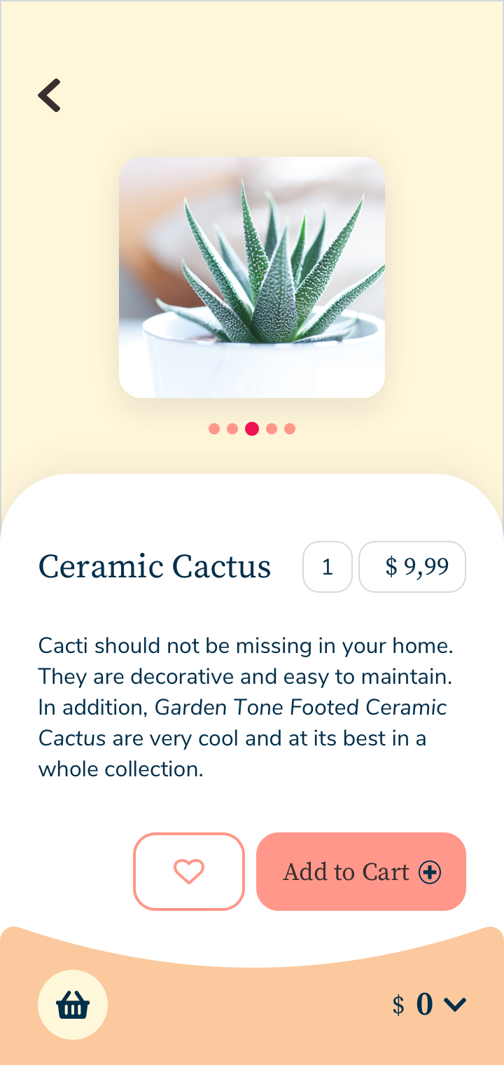
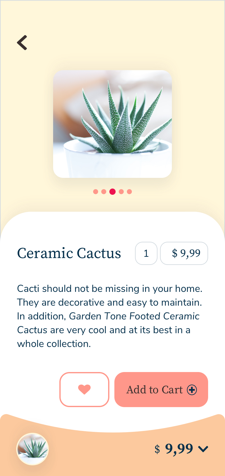
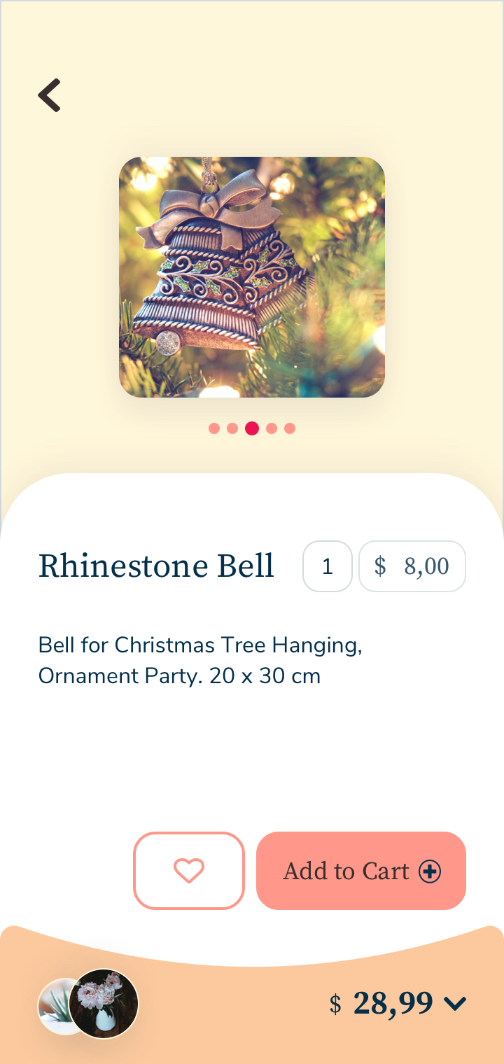
The application allows users to filter the items. There are two filtering options one is general and most common item filter; the other option is an advanced filter that helps the user search by color, price, special events, or the place that they want to use them.
Brand Guidelines
- Guiding Principles
- Our Logo
- Logo please don’t
- Color Palette
- Font Style
- Image Style
- Illustration Style
- User Flow Diagram
- Wireframes
- User testing notes and results
- Responsive Design
- Mockups
Guiding Principles
Home Decor is an e-commerce web app which helps people to find elegant, stylish and unique home decor items.
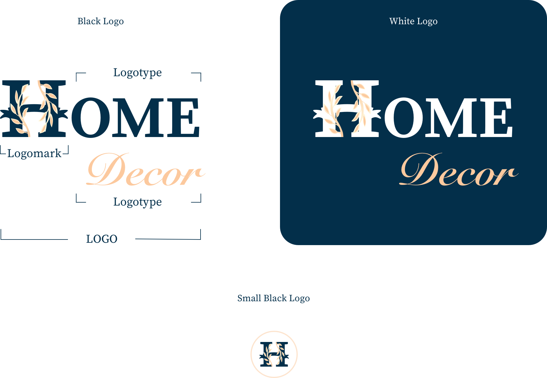
Our Logo
‘Home sweet Home’ made me influenced; that’s why I chose the big serif font ‘H’ and small decorative ‘decor’ word.
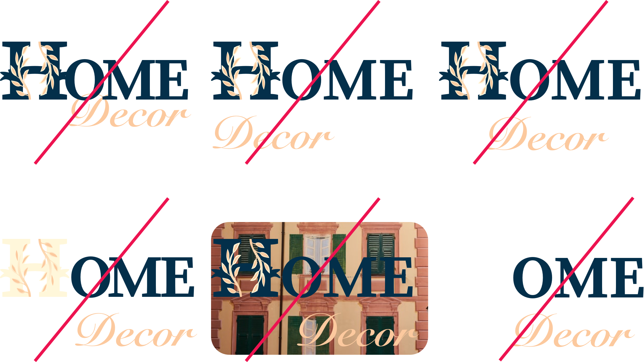
Logo please don’t
The examples illustrate some common incorrect uses and application errors.
Color Palette
I chose Soft colors used to awaken a peaceful atmosphere during shopping and the red-orange hues to create excitement and stimulate the desire to buy.

Font Style
Source Serif Pro is the font used for headlines on marketing and product web experiences. It is a serif typeface and a complementary design to the Source Sans family. It is available for most world alphabets. Nunito is the font used as the secondary typeface for paragraph text and small UI elements. The third available typeface is Snell Roundhand which is an impact font for design purpose only.
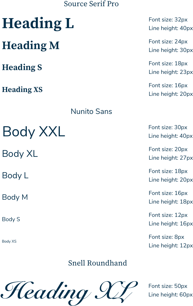
Image Style
I chose the bright background images throughout the project to create a friendly atmosphere and with some dark background images to highlight items and create contrast.
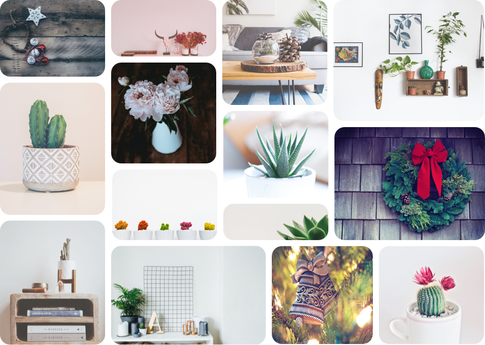
Illustration Style
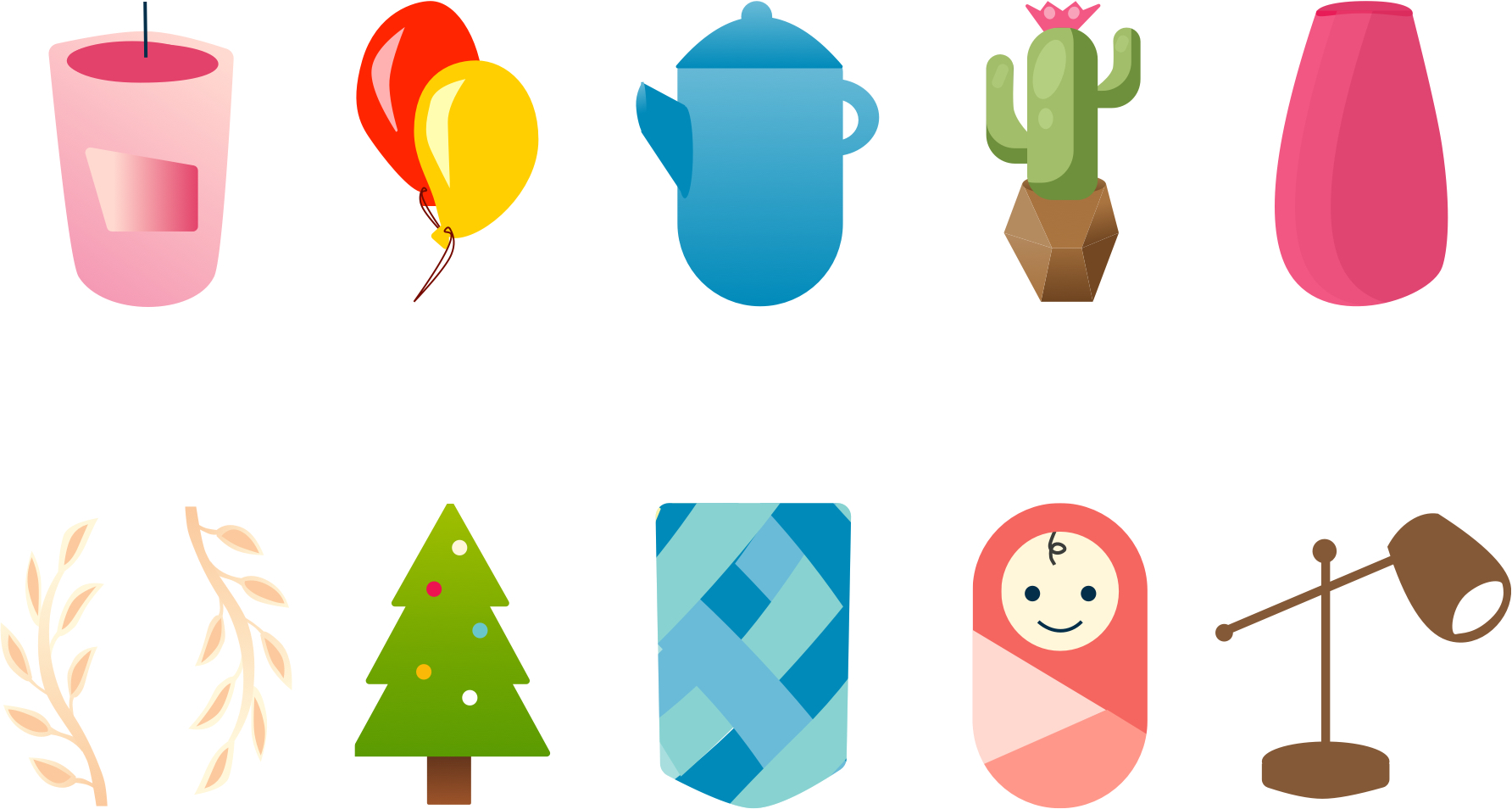
Illustration style is friendly, unique and easy to understand.
User Flow Diagram
Based on several user stories from the brief, I created a user flow diagram.
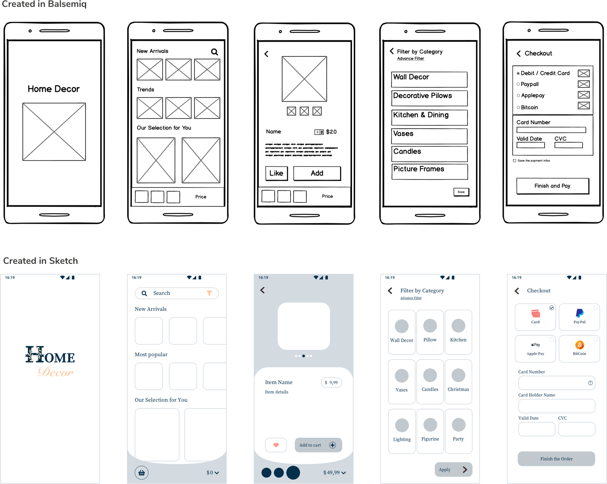
Wireframes
I created the low and mid-fidelity wireframes created based on the user flow, which provided all the information. The rough wireframes present all the ideas rapidly and save time.
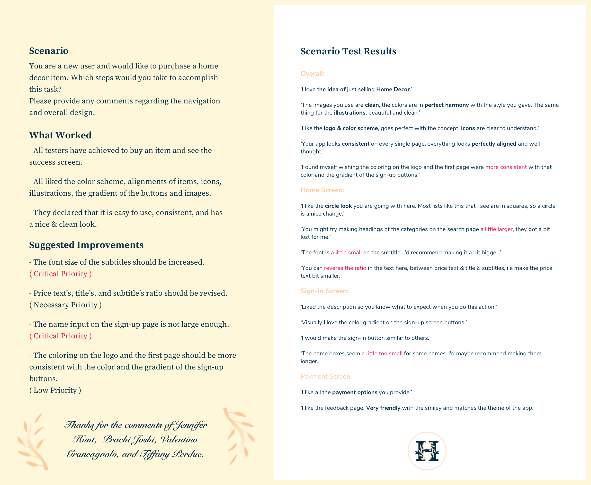
User testing notes and results
Following the round of user testing, I made the changes and came to the final stage.
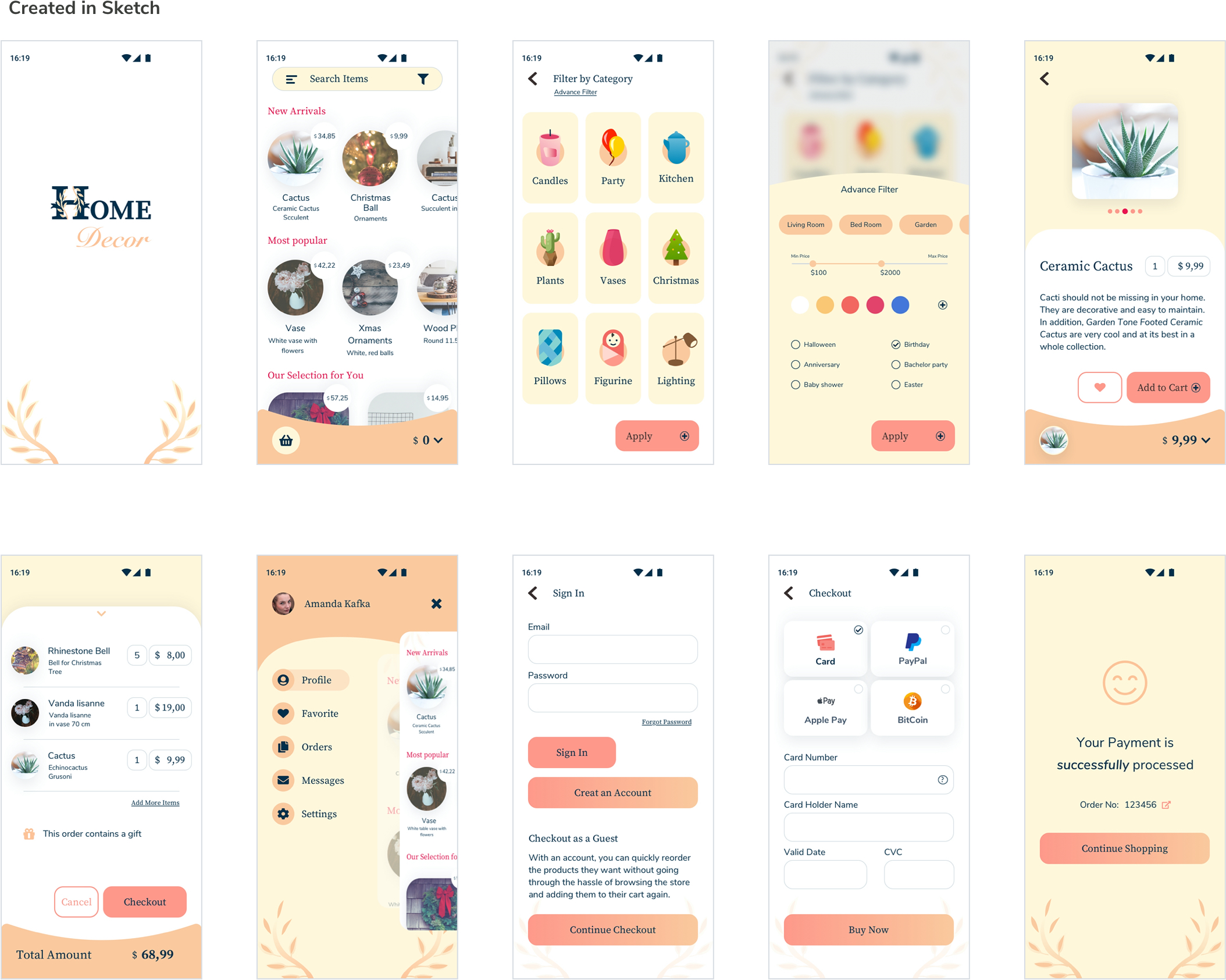
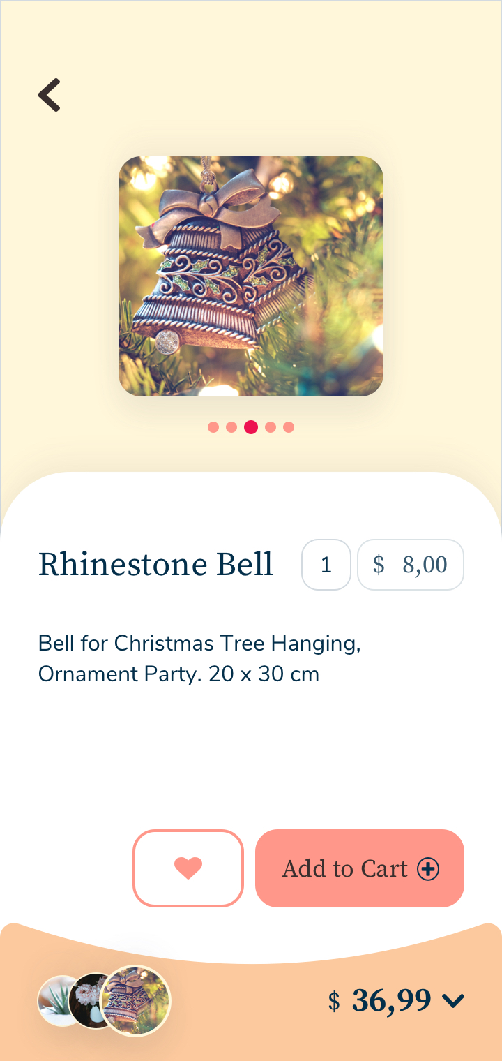
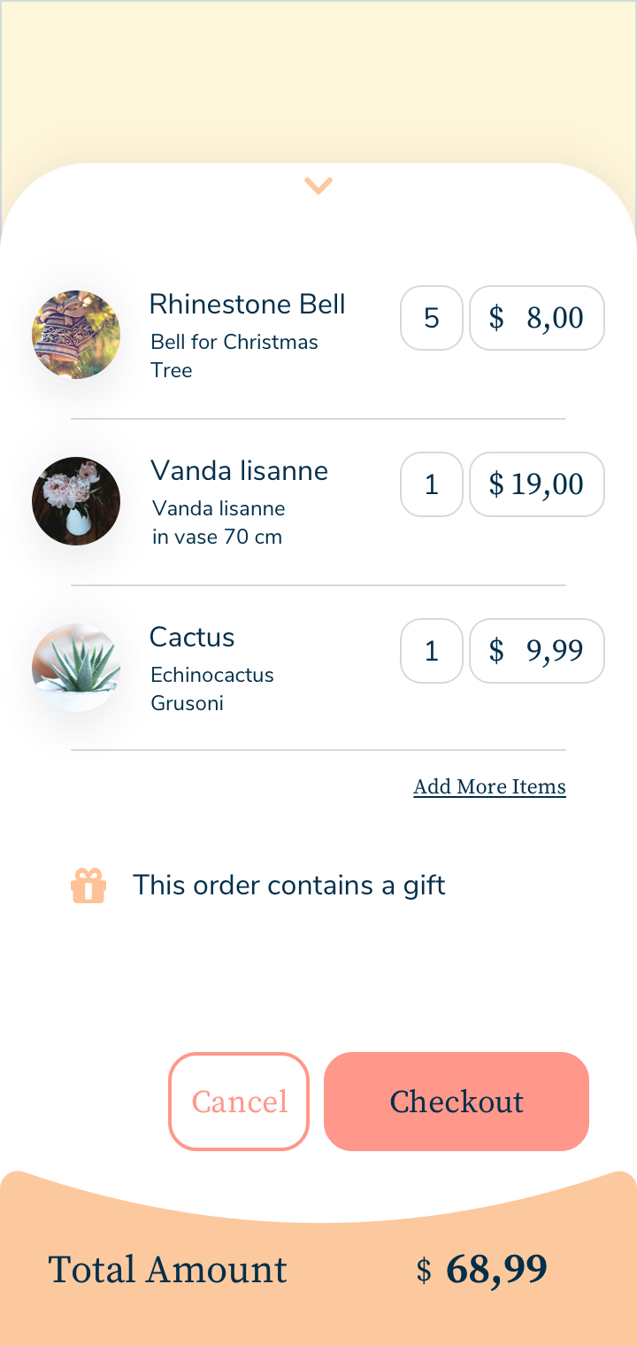
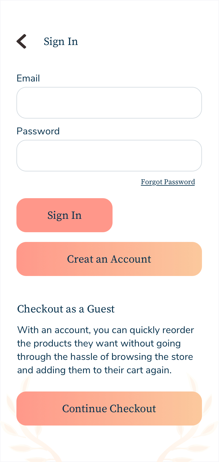
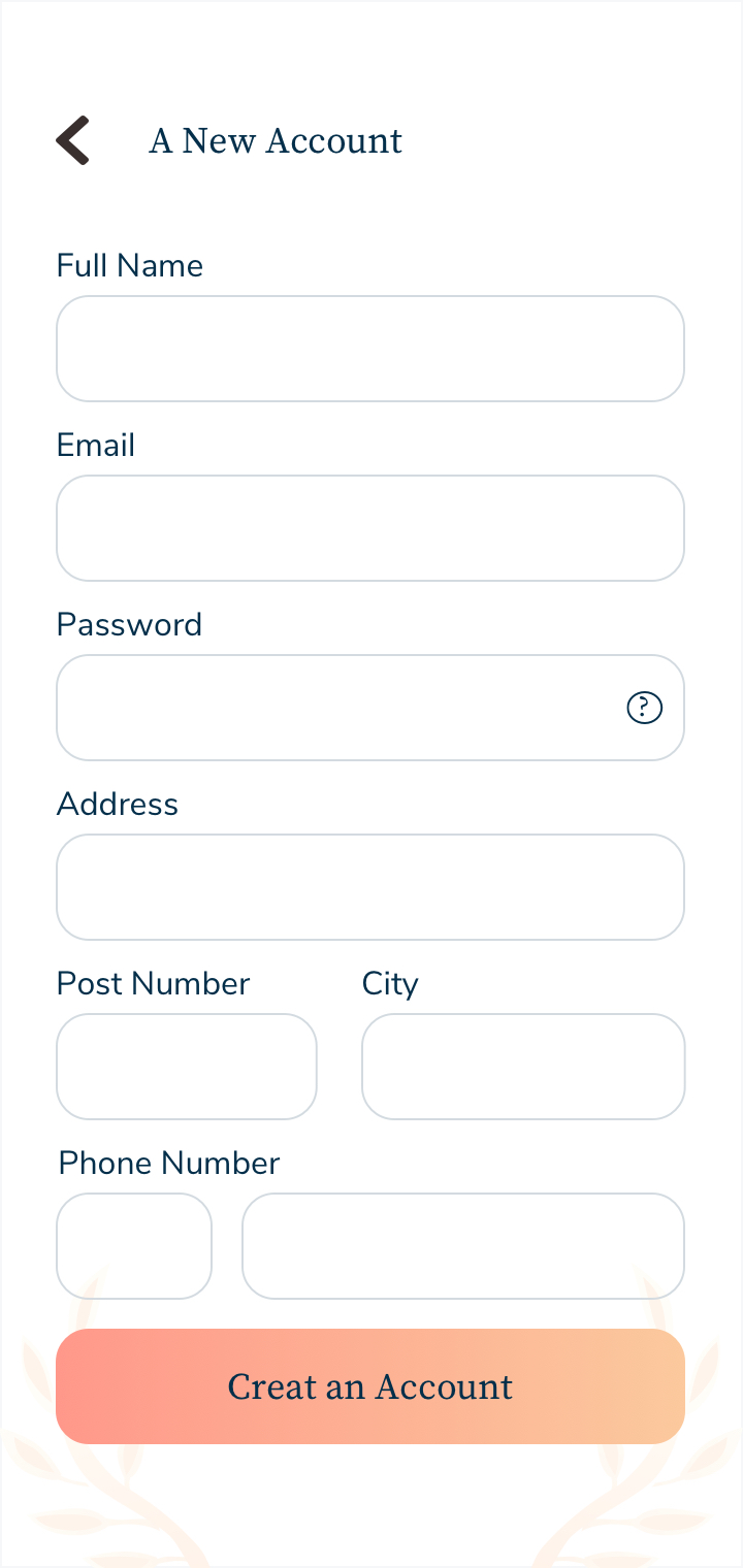
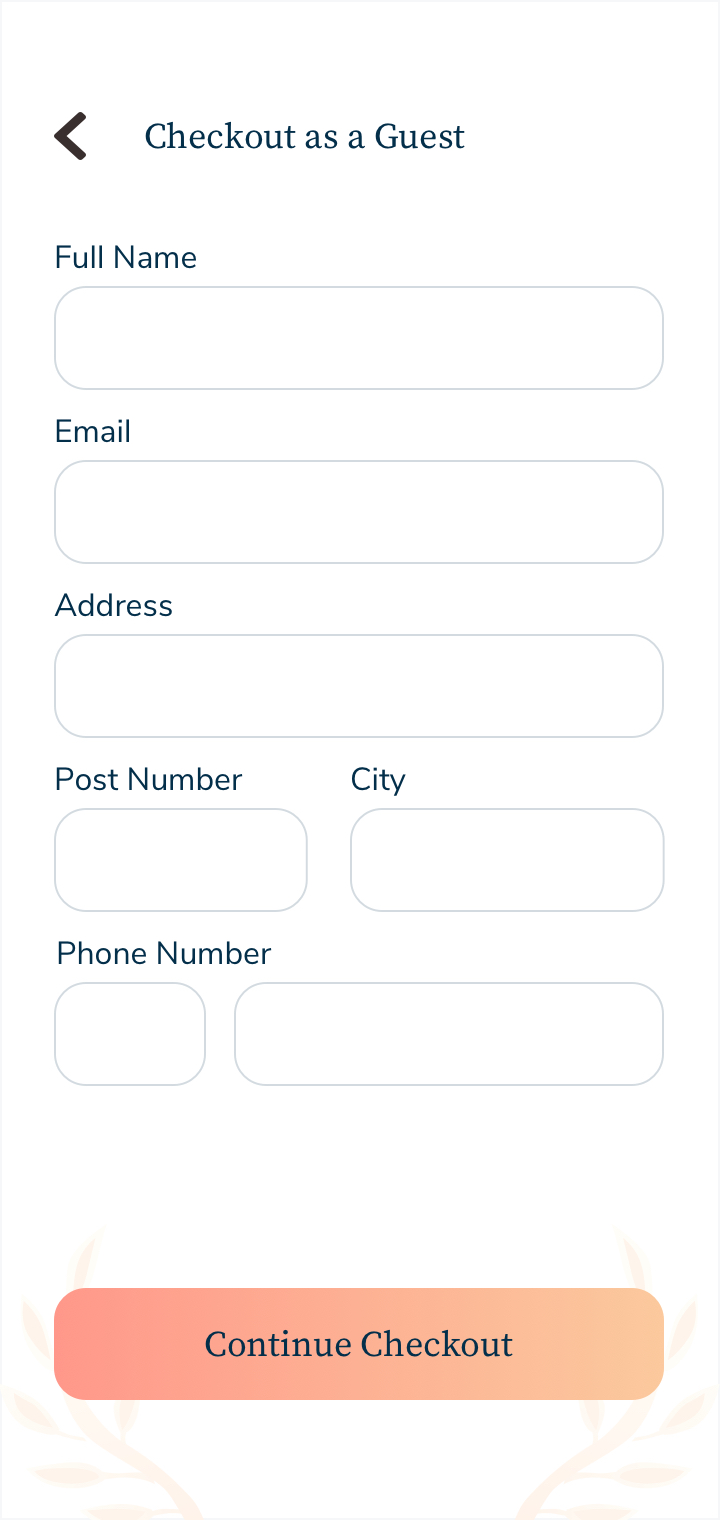
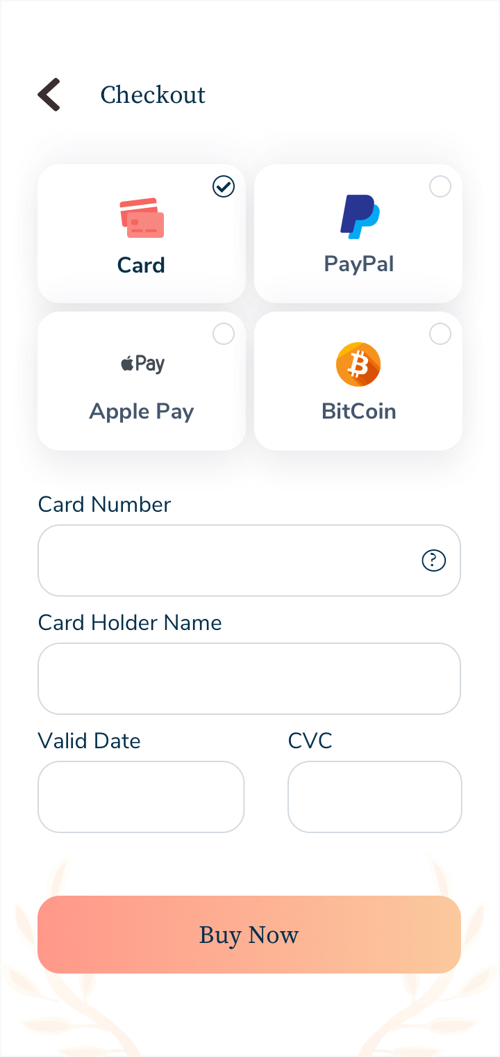
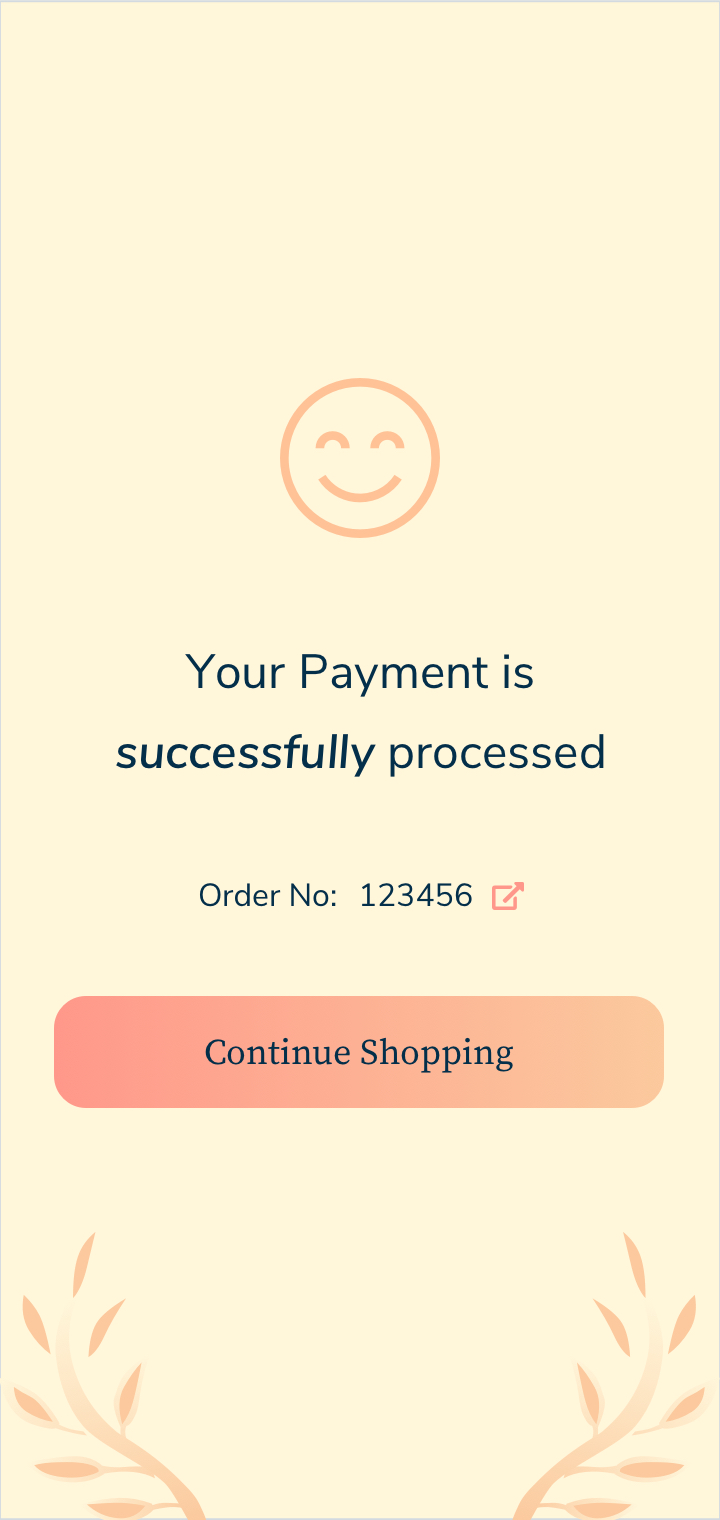
Mockups
Finally, the optimized features are added to create more efficient and intuitive flows.
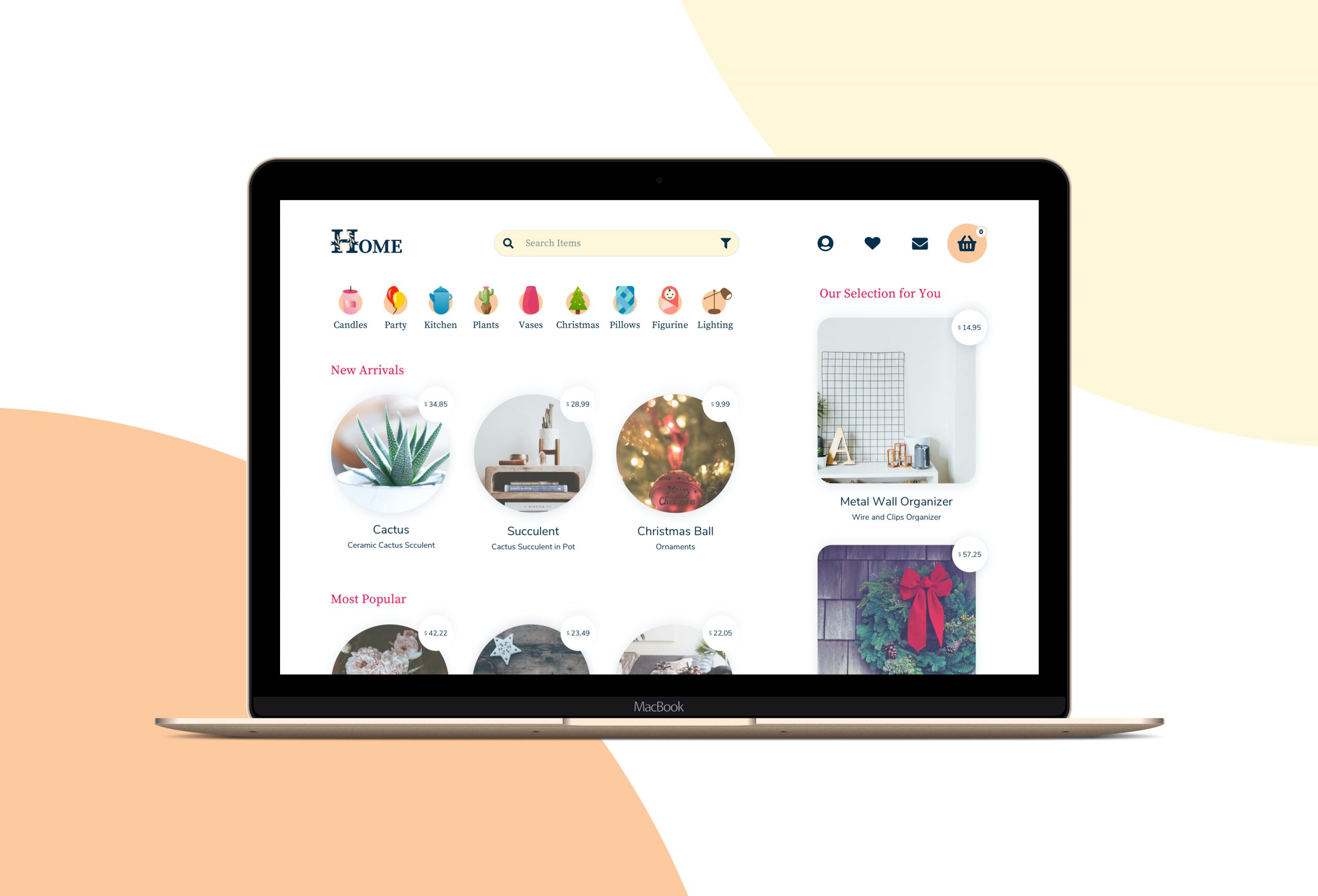
Responsive Desktop Design
For Responsive Design, the breakpoints are set at the exact device widths.
What I learned?
I learned about building a cohesive brand, how to translate an entire brand into brand guidelines, and how I can go about creating a brand guidelines document of my own for this project.